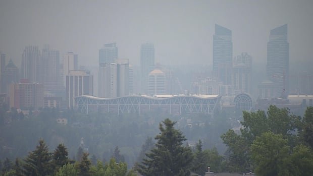
It used to be rare to see smoke in Calgary’s air, but in recent years it’s become a frequent occurrence, as wildfires burn bigger, hotter and earlier in the season than had been normal in previous decades.
An Environment Canada metrologist brought this to the attention of city councillors during an emergency management meeting in May 2023, citing data that the weather agency had gathered dating back to the 1950s.
“We’ve seen a big increase in the last several years,” Terri Lang told councillors at the time, as Calgary endured some of the worst air quality recorded anywhere on the planet.
Calgary went on to have its smokiest year on record, with 512 smoke hours recorded between May and September 2023.
The following year, Calgary saw another 200 smoke hours amid the 2024 wildfire season.
That compares to an average of just 12 smoke hours per season from 1981 to 2010. (A standard period of 30 years is used by Environment Canada to define “climate normals.”)
How is 2025 shaping up when it comes to smoke?
The charts on this data dashboard will track both the intensity and frequency of wildfire smoke in Calgary using automated computer scripts. Some will update daily; others hourly.
You can bookmark the page and come back to it whenever you like to see the latest information.
To start, let’s look at the latest air-quality readings in Calgary for one of the key pollutants created by wildfire smoke: fine particulate matter.
Latest Calgary PM2.5 readings
Also known as PM2.5, this pollutant consists of extremely tiny particles suspended in the air — less than 2.5 microns (0.00025 centimetres) in diameter.
For context, a human hair is roughly 70 microns wide. A red blood cell is about seven microns in diameter.
These fine particles in the air can come from various sources, but a common one in Calgary is wildfire smoke.
“If you just look at forest fires, about 90 per cent of that is PM2.5,” said Mandeep Dhaliwal, air quality program manager with the Calgary Region Airshed Zone, which operates pollutant-monitoring stations across the city.
Below you can see the latest PM2.5 readings from those stations.
Latest smoke map
Environment Canada also uses PM2.5 readings to track wildfire smoke.
Below you can see a map showing where the latest smoke plumes are circulating over North America.
You can scroll around and zoom in on the map to take a closer look at Calgary or any specific area.
Calgary air quality over the past week
Do you think you smelled smoke in the air the other day but aren’t sure? Do you remember a bit of haze when you looked out your window over the weekend but can’t remember exactly?
If you want to get a sense of what the air was like recently in Calgary, the charts below are for you. They depict hourly PM2.5 readings over the past week.
You can scroll over or tap on each of the lines for more info about the exact reading and time it was taken.
Calgary smoke so far this wildfire season
Environment Canada also uses smoke hours to track the effect of wildfires.
It defines a smoke hour as a period of time when visibility is reduced to 9.7 kilometres (six statute miles) or less due to smoke, as measured by some of its hourly weather-monitoring stations.
The disadvantage of this measure (as compared to the PM2.5 readings) is that it doesn’t tell you exactly how smoky it is. A slightly smoky hour won’t register, in Environment Canada’s data, if visibility isn’t affected enough. And a moderately smoky hour will be recorded the same as an extremely smoky hour.
But the advantage is that Environment Canada has been tracking smoke hours this way for the better part of a century, allowing us to compare our current experience with smoky skies to those of people decades into the past.
Another advantage is that it tracks naturally with our intuitive experience of smoke in the city. Was it smoky just in the morning or all day? Was it smoky just for a day or two, or all week?
The calendar-style chart below depicts how things have been going in the current wildfire season.
Calgary smoke in wildfire seasons past
Using this same approach, we can peer back into past wildfire seasons, at a glance.
The chart below depicts each season as a horizontal band. Each day is a coloured line on that band. The colour of each bar represents the number of smoke hours that day.
It makes for a tall chart. But, as you scroll down, you can quickly see how different Calgary’s air looked in the 2000s, 1990s, 1980s, 1970s, 1960s and 1950s.

